
Building Harmonious Color » Building Harmonious Color By Howard Lyon - Last updated: Monday, September 24, 2012 - 30 Comments “One more step, Mr.

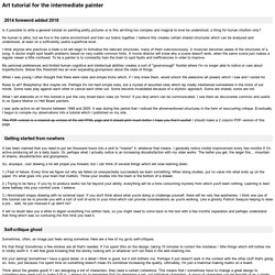
Hands,” said I, “and I’ll blow your brains out!” By N.C. Wyeth I struggled early in my career with the application of color. The reality was that I had no clue how to put a palette together for a painting. I do feel I have come a long way in my understanding of color, but I also know that it is something that will provide a deep and satisfying challenge for the rest of my life. Cymon and Iphigenia by Lord Frederick Leighton Creating Harmony Let’s start with a color wheel. The color of the light in your scene limits the colors in the spectrum available for you to paint with. The image above is simulating a scene as if you placed a 50% red filter over your eyes, or as if your scene were lit with light the color of the circle in the middle of the color wheel.
Look at how the red light has limited the colors. Now we are really dropping colors. Experimenting with temperature. The Illusion of Depth - Contrast, Aerial Perspective and Form. PSG Art tutorial. Foreword I believe there is logic behind why a picture works or not.
I also believe that humans are meat machines, and that one day computers will be able to emulate humans and what we do. Since logic can be formulated into rules, guidelines and theories, these can be shared. I will attempt to do so here. Note that I have just empirically deduced the theories I present here, and that I'm a highly fallible meat machine. Many rules also play against each other and may cancel each other out, or become invalidated because of a stylistic approach . The far most useful critique I can give developing artist is: Practice. Updates 2012 May02: Clarified stuff in the Terminology section.
Table of contents Licence This tutorial is, in its current form, free to translate and 'mirror' in that form. Because I may be updating it and new versions are generally better, I'd rather not have it mirrored too much. I guess this licence comes pretty close: Terminology (Upd. 2012) Seeing (Upd. 2012) Light stuff Exposure. The Dimensions of Colour. Colour theory simplified. Mastery of colour theory is essential for artists.
Philip Straub takes a look at some the basic principles of colour. When used effectively, colour helps describe mood and evoke an emotional response from the viewer. Correct colour application is one of the most important components for a painting to succeed. The application of colour isn’t just something that an artist inherently knows, it’s a craft that’s studied. There are rules to follow and ignore but all artists must begin with the basic building blocks of colour theory to find success. There’s an incredible amount of scientific documentation available; however, much of it’s not applicable to artists.
The most important info on colour theory. From issue 09. Understanding Colour and Value. Technical Insights from “Not Far from Home” #20 « daniel gerhartz. April 2, 2012 Warm, Cool, Warm… One of the key elements that I have taken away from years of painting from life is the heightened awareness of the warm /cool interplay on the subject as the form turns.
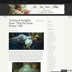
I know I have mentioned this on previous posts, but its importance bears mentioning again. In this image and the details to follow, you will see how the shifting of temperature accentuates the volume and three dimensionality of image while holding the values in a simple mass. It can also be seen in great detail within the two page spread of, “Indigo and Ivory”, 30” x 60” (Page 118 and 119 from “Not Far from Home”), In these details, you can see the transitions from warm to cool inter-playing throughout the forms, but most specifically where noted with letters W (warm) C(cool). This study of warm and cool as it relates to light and form is discussed and demonstrated in great detail in our re-released Video “Her Mother’s Locket”. Click image to see preview trailer…Thanks Enjoy! Like this: Class demo on warm and cool. Here's a portrait study of an imaginary person that I did as a demo for the digital painting class that I'm teaching.
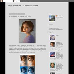
The focus was on color saturation and how that relates to color temperature. The excercise was to do a head study using just one hue and to vary the saturation of that hue to produce warm and cool colors. From that point, it's not much of a jump to go to full color with varied hues. ..., Palette/Color tutorial by neonnoodle.