
Education. ScapeToad - cartogram software by the Choros laboratory - download. [Facebook] netvizz. Infographics from KISSmetrics. Vídeos sobre la herramienta de Google para crear Infografías. Si os gustan las infografías seguramente conoceréis Google Public Data Explorer, la herramienta que Google lanzó hace algunos meses y que nos permite mostrar de forma gráfica datos relacionados con la evolución de diferentes países y regiones de todo el mundo.
Os dejo con algunos vídeos realizados usando esta herramienta, desde tutoriales explicando cómo se usa, hasta animaciones impresionantes mostrando la evolución de 200 países en pocos minutos. Presentación del proyecto, en español 5 minutos mostrando la evolución de 200 países en 200 años Una descripción completa de la herramienta Este vídeo es sólo parte del que podemos ver en fora.tv, presentado desde la Berkeley Graduate School of Journalism.
Evolución del consumo de energía y teléfonos móviles En la descripción del vídeo, en youtube, muestran enlaces con los gráficos completos. Consejos para usar el sistema. The Past, Present & Future of Email [INFOGRAPHIC] Our reliance on social media, instant messaging, texting and especially email is growing at a rapid rate, according to a new study.
![The Past, Present & Future of Email [INFOGRAPHIC]](http://cdn.pearltrees.com/s/pic/th/present-future-infographic-12089853)
Microsoft commissioned independent market research firm MarketTools to survey 1,268 professionals and students over the age of 18 to find out about their email and online communication habits. "We wanted to have an independent observation of how people were using the different communication tools at their disposal," Microsoft Group Product Manager Paco Contreras told Mashable. The survey found that a whopping 96% of respondents said their email load either increased (45%) or stayed the same (51%) over the last year. Ninety percent said that social media communication has increased (28%) or stayed the same (65%). The same is true for text messaging: 28% said texting has increased for them in the past year, while 65% said they have been texting at the same level over the past year. How have your email habits changed over the past decade? 40 Useful and Creative Infographics.
Six Revisions Menu Main Categories CSS HTML JavaScript.
AmMap: Interactive flash maps. Gapminder: Unveiling the beauty of statistics for a fact based world view. AmMap: Interactive flash maps. "Infographic" Infographics Blog: Reviews of the Best Infographic Design Ideas. Cool Infographics - Blog. Ward Shelley Homepage. Building a 3D Infographic Brick by LEGO Brick#!5773295/3d-lego-infographics.
A cartogram done in real 3D. My former Art Director at Público Fernando 'Rapa' Carballo exhibes these days and until february 27th is Antifichus at Casa de América in Madrid.
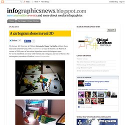
A review of 200 years of his native Argentina seen with designers eyes. To works exhibited are done with friends and collegues, and one of them is the inforaphics journalist of Publico Samuel Granados. His project is very funny: a 3D cartogram about emigration and inmigration between american countries. But in true 3D: made with Lego pieces, as he explains, "to seize the space of the exhibition" and "allow you to watch teh cartogram from different perspectives". One side of the map show the emigrants of each zone, the opposite shows the inmigrants (both represented by the volume of the pieces). Social media. Fluid Dynamics. Google Earth Engine. Interceder. The_internet 2160x3240.jpg. CEO Portal. World News Map. Information Is Beautiful. IS IE9 A MODERN BROWSER. Windows-phone-7. GraphicMania. Reports and analyzing summarizes are not interesting for many people, especially when many Internet users need to get the information rapidly.
However, the visualized information are more suitable for the internet users than the text reports. Also, it helps remembering information through the visual memory for further reference. Infographics use the visual elements to deliver the information in an interesting way and easy to understand charts. Each infographic design changes based on the type of information and the best way to deliver it. The amount of information plays a critical rule in displaying the information because the graphic elements used in the infographic charts should help displaying the information and not distract it. Eugenio Archontopoulos. Data Visualization: Modern Approaches - Smashing Magazine. About The Author Vitaly Friedman loves beautiful content and doesn’t like to give in easily.
VIZUALIZE: Archive. 10 Gorgeous Social Media Infographics. Infographics make information easy to consume. Mundane Charts vs Info graphics: Although they are essentially driven by the same set of information, our eyes are more attached to the ones that give aesthetic pleasure. 10 Beautiful Social Media Infographics.
This series is supported by Ben & Jerry's Joe, Ben & Jerry's new line-up of Fair Trade and frozen iced coffee drinks.
Learn more about it here. Infographics help communicate information in a digestible manner as they creatively present data in an understandable and engaging format. With social media growing at an ever increasing pace, there is now a wealth of data about how people interacting with one another on the web. Naturally, infographics have proven an excellent aid in expressing high volumes of social web information in a clear, visually appealing manner. SFMOMA ArtScope. 10 Awesome Free Tools To Make Infographics. Advertisement Who can resist a colourful, thoughtful venn diagram anyway?

In terms of blogging success, infographics are far more likely to be shared than your average blog post. Dzinepress. NYT Visualization Lab. Online tools for business performance management. Creating Effective Poster Presentations. Data Visualization, Infographics, and Statistics. Well-formed data.