WordWanderer – take your text for a walk. Constellations of Directors and Their Stars - Interactive Feature. Wefeelfine. Poetry on the Road 2004. As Poetry 03 is line-based, it was almost a logical step to think about shapes when it came to designing Poetry 04.
In Poetry 04, every poem is visualised as a cluster of polygons, while every polygon represents a single word. The exact shape of each polygon is based on the statistical allocation of letters within a language. If a letter has a very high frequency in the language, its impact on the overall shape of the polygon is very strong. A common structure in many languages are alternating vowels and consonants. As there are only a few vowels, their frequency in a text is much higher. Based on these simple rules, a computer program was created that turned 20 poems into a complex, three-dimensional space. We Feel Fine / by Jonathan Harris and Sep Kamvar. ReMap. Statistics eXplorer.
Gapminder: Unveiling the beauty of statistics for a fact based world view. Every Noise at Once. Audio Room. I can't get data from your microphone.

Have you enabled Web Audio Input in. Public/Private. Public/Private is a game that explores the topic of privacy in our cities by focusing on where we find it.
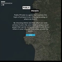
By choosing where in your city you seek privacy most often, you produce a visual graph representing those choices. Your graph is then combined with graphs generated by the rest of the global audience, creating a live data-visualization that illustrates how our experience of privacy changes at a local and global level. As more participants play Public/Private, more of the complexities of privacy in urban settings are illuminated. Konduit. Timeline. Elastic tag maps. Map your moves. Data This map distills more than 4000 moves from over 1700 people, collected in an informal survey by WNYC, a New York based public radio station.
For generating the geo–coordinates from the entered ZIP codes, I used the free bulk geocoder at gpsvisualizer.com. I did not check every single data row in detail, so a few of the moves might be misrepresented. Mapping As most moves occurred from, to or within the New York area, this area displayed enlarged in the white circle at the center of the graphic.
Visual markers. Global Agenda Council Constellation. Chrome Experiment #500. Data Visualization Network of Resources. A Visual Backchannel for #parkingday. EdgeMaps: Philosophers - Similarity Map. Fluid Views: Photos from Flickr. Remix of the Century. Inventing Abstraction. Personal Knowledge database. Dis-moi où tu me plaîs. Inventing Abstraction. Animated Factorization Diagrams – Data Pointed. Rennes - Visualisation de données. Digital Volvelles Tabletop Touch Application. Wind Map. An invisible, ancient source of energy surrounds us—energy that powered the first explorations of the world, and that may be a key to the future.

Typode. Lostalgic. Lostalgic This project is based on the entire ABC's LOST TV show scripts, 115 episodes in 7 seasons, that I managed to parse from Lostpedia.
I also parsed this page with additional information about hidden characters relations. My aim for this project is not (only) to visualize some properties and patterns out of the script but actually to allow to read and enjoy the series in a different way. I plan to add new views (will inform through twitter), more aimed to reveal global patterns in the script, and I will include cliffhangers and writing teams information. FontBomb - Stylishly destroy the web. Inc. Nobel prize winners demo. The Whale Hunt / A storytelling experiment / by Jonathan Harris. Jonathan Yuen. ECODA!DOBUTSUEN. Emoto. Four Ways to Slice Obama’s 2013 Budget Proposal - Interactive Feature. Web Lab. Plot your course in space & time. The e-diplomacy Hub, A real-time window onto digital diplomacy in action.
1972 - 2012 : l'Odyssée du développement durable. Trends In Higher Education. Riot Rumors. Data Visualization Network of Resources. An Overview of the Euro Crisis - Interactive Graphic. Arrows show imbalances of debt exposure between borrowers in one country and banks in another; arrows point from debtors to their bank creditors.
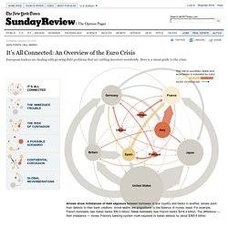
Arrow widths are proportional to the balance of money owed. For example, French borrowers owe Italian banks $50.6 billion; Italian borrowers owe French banks $416.4 billion. The difference — their imbalance — shows France's banking system more exposed to Italian debtors by about $365.8 billion. The risk to countries’ debts and economies is indicated by color: Inside the courts: what happens to defendants, visualised. Explorable Explanations. Bret Victor / March 10, 2011 What does it mean to be an active reader?
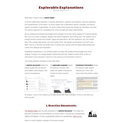
An active reader asks questions, considers alternatives, questions assumptions, and even questions the trustworthiness of the author. An active reader tries to generalize specific examples, and devise specific examples for generalities. An active reader doesn't passively sponge up information, but uses the author's argument as a springboard for critical thought and deep understanding. Do our reading environments encourage active reading? Explorable Explanations is my umbrella project for ideas that enable and encourage truly active reading. This essay presents examples of few initial ideas: World Events Visualiser. Factbook eXplorer. The evolution of the web. ASK KEN™ - Visual Knowledge Browser. Gods, Achaeans and Troyans. The Sexperience 1000 - Sexperience. Welcome to The Sexperience 1000, an interactive journey through the sexual experiences and preferences of one thousand British individuals.